

Rendered homes are one of the most satisfying exteriors to work with. Unlike brick, where the existing material always competes with your paint choice, a rendered surface gives you a clean, smooth canvas. The colour you choose becomes the dominant visual statement of the whole property.
For Sydney homeowners — particularly in South-West suburbs like Bankstown, Canterbury, and Campsie — getting the exterior paint colours for a rendered home right can genuinely transform kerb appeal and add real value. Get it wrong and you’ll be repainting sooner than you planned.
Why Colour Choice Matters More on Render
On a brick home, the texture and variation in the brick absorb a lot of visual attention. On a rendered home, the paint colour and finish are everything — there’s nothing else to distract the eye. This means good colour choices look exceptional on render. But it also means poor ones are much more obvious.
Sheen level matters too. A flat or low-sheen finish tends to look more refined on rendered surfaces. High-gloss on render amplifies every imperfection and often reads as cheap regardless of the colour underneath. Our exterior painting services in Bankstown cover finish selection as part of every consultation.
The Colour Families That Work Best
Warm Stone and Sandy Tones
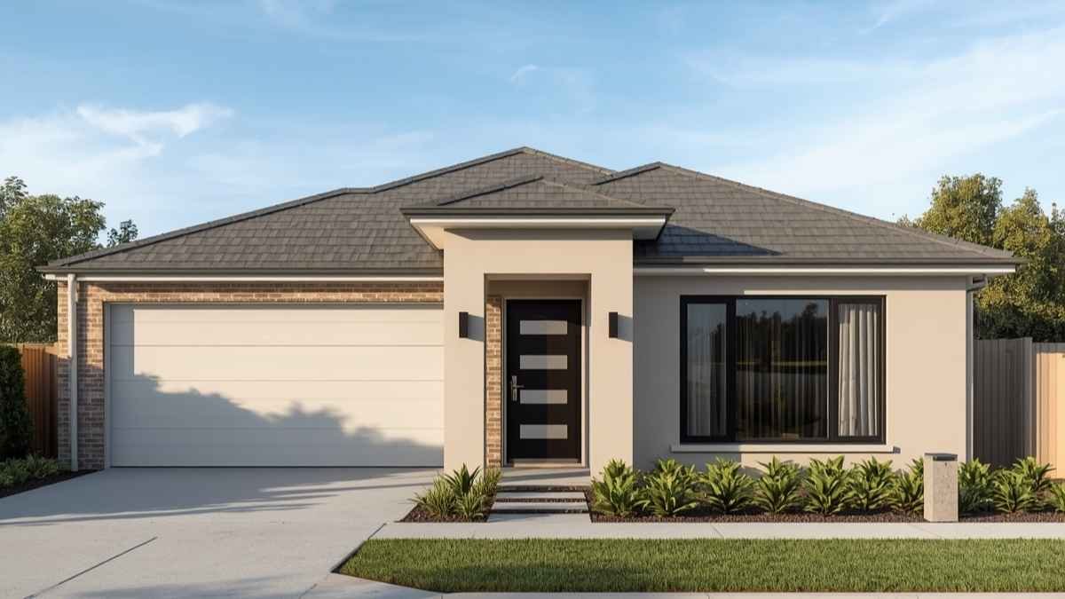
This is the most popular category for rendered homes in South-West Sydney, and for very good reasons. Warm sandy tones — natural stone, sandstone buff, warm greige — complement the regional environment, age gracefully, and don’t show dust and dirt as obviously as lighter or cooler options. They also work with a wide range of trim colours.
Good references: Dulux Antique White USA, Taubmans Natural White, Haymes Warm Beige. These are broadly appealing choices that perform well at resale and in diverse lighting conditions.
Soft Greys and Warm Greys
Grey has dominated Australian residential architecture for a decade and rendered homes carry it particularly well. The key is choosing the right grey — a warm grey with slight beige or green undertones reads as sophisticated and contemporary, while a pure cool grey can look cold and clinical under Sydney’s afternoon sun.
In South-West Sydney’s predominantly warm afternoon light, warm grey shades outperform cool greys significantly. Try Dulux Monument for a deep warm grey, or softer warm greys like Taubmans Grey Tones for a more understated result.
Crisp Whites and Off-Whites
A white rendered home is clean, bold, and genuinely timeless — when done correctly. The challenge is choosing a white that doesn’t look stark or clinical. Pure bright whites on large rendered surfaces look sharp in photos but can feel almost sterile in person. Warm off-whites with subtle undertones photograph beautifully and maintain the premium feel across all lighting conditions.
The classic render combination: warm off-white on the main body, white on window frames and fascias, and a deep contrasting colour (charcoal, black, or deep blue-grey) on the front door.
Earthy Mid-Tones
A growing trend in Bankstown and Canterbury — earthy mid-tones that reference the Australian landscape. Warm olive, dusty clay, aged terracotta-adjacent, and natural ochre tones are appearing more frequently on South-West Sydney homes. These work best on properties with some architectural character — a projecting entrance, a distinct roof profile, or feature timber elements — rather than on very flat, minimal facades where a more restrained tone often works better.
Deep Charcoal and Near-Black
Bold, modern, and increasingly popular on newly renovated homes in the area. Deep charcoal rendered homes look excellent when the architecture can support the visual weight — strong geometric lines, clean rooflines, and good contrast with paving and landscaping all help. Dark colours absorb significantly more heat than light ones, which is worth considering in South-West Sydney summers.
Trim Colour — Where the Detail Is Won or Lost
On a rendered home, trim colour defines the architectural lines. The combinations that consistently work:
- Warm stone body + white trim — classic, broadly appealing, works on most styles
- Warm grey body + off-white or white trim — contemporary, popular in SW Sydney currently
- Off-white body + charcoal or black trim — sharp contrast, photographs very well
- Deep charcoal body + white trim — bold and dramatic, needs the right property to carry it
Common Mistakes on Rendered Exteriors
- Choosing colours with strong blue or green undertones for west-facing elevations — these read very differently in afternoon sunlight
- Using high-gloss on large rendered surfaces — it highlights imperfections and ages poorly
- Matching roof and wall colour too closely — the lack of contrast flattens the whole facade
- Selecting dramatically dark colours on small homes — the compression effect makes compact facades feel oppressive
Always Test on the Actual Surface
Never select your final exterior colour from a chip alone. Buy a small tester pot and paint a 30 x 30cm patch directly on the wall — on two elevations if possible, since the same colour reads differently on north-facing versus south-facing surfaces. Check it in morning light, midday, and late afternoon. The difference can be significant.
Colour Consultation at Icon Touch
If you’re not confident making this decision independently, Icon Touch helps clients with colour selection as part of our quoting and preparation process. Our exterior painting services for rendered homes in Bankstown and South-West Sydney include product specification, finish selection, and colour guidance. Combined with our house rendering services, we can take a property from tired render to a finished, painted result in a single project.
Every exterior job includes full surface preparation and a 5-year workmanship warranty.
Contact us today for a free on-site assessment and colour discussion.
[ Need Help With Colours? Contact Icon Touch for a Free Consultation ]
