

Choosing paint colours seems easy until you’re holding 20 swatches under a kitchen light and none of them look quite right. It’s one of the most common causes of painting regret—and it’s almost always avoidable with the right approach.
This guide is written specifically for homes in Bankstown, Canterbury, Campsie, and South-West Sydney, where the housing mix ranges from post-war brick homes to rendered units and modern fibre cement builds. The colour rules that work in Mosman don’t always translate to western Sydney — so let’s work with the context we actually have.
Start With What’s Already There
Before picking a single colour, look at the fixed elements in your home that aren’t changing — flooring, roof tiles, existing brick, kitchen benchtops, bathroom tiles. These anchor everything else. Your new paint colour needs to respond to what’s already there, not compete with it.
For example: if your home has a terracotta roof and cream brick, you’re working with warm undertones throughout. A cool, blue-grey exterior paint will clash — even if you’ve seen it look great on another house. Context is everything.
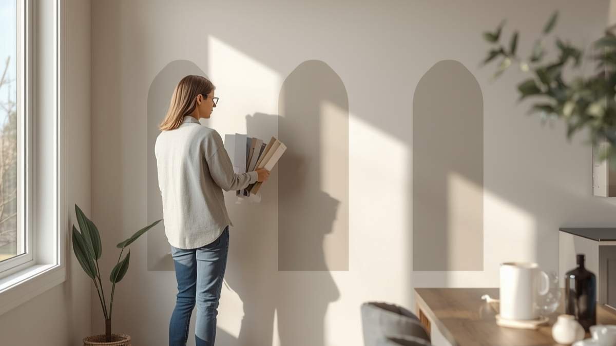
Understanding Paint Undertones
This is the detail most homeowners miss. Every paint colour — including whites and neutrals — has an undertone. Warm undertones lean yellow, red, or orange. Cool undertones lean blue, green, or purple. And they become dramatically more obvious on a full wall than they ever look on a chip.
In South-West Sydney, rooms often face west or south-west and receive warm afternoon light. In those spaces, cool undertones in whites and light neutrals can look almost grey by 3pm. Warm undertones in the same light read true and inviting.
The easiest way to check: hold the chip next to a pure white sheet of paper. The undertone becomes obvious by comparison.
Interior Colour Strategies
Living Areas and Open Plans
Open-plan living is common in Bankstown units and newer homes. In these spaces, using a consistent base colour — with minor sheen variations — creates visual flow and makes the area feel larger than multiple different colours would. Bold feature walls work well in living areas but avoid wrapping a dark tone around all four walls in an already-compact space.
Popular warm neutral choices for South-West Sydney living rooms: Dulux Antique White USA, Haymes Dusty Miller, Taubmans Linen. These read as warm off-white under most Sydney lighting conditions without going too creamy.
Kitchens and Bathrooms
These rooms deal with moisture, steam, and grease. Beyond choosing anti-mould products (which our interior painting services specify), colour-wise you want mid-tones or soft whites in a satin or semi-gloss finish. Avoid very dark colours in small bathrooms — they absorb available light and make the space feel even smaller.
Bedrooms
Bedrooms are where you have the most latitude. The goal is a colour that helps you wind down — which generally means cool blues, warm sage greens, and soft earth tones outperform high-energy reds, oranges, and bright yellows. These palettes consistently appear in sleep quality research as the most restful colour environments.
Exterior Colour Choices for Bankstown and Canterbury
For Rendered Homes
Rendered homes give you a clean canvas — no brick undertones to work around. Popular choices in this area include warm stone tones, soft greys with warm undertones, and earthy off-whites. These hold up well against the dust and pollution of a south-western Sydney environment and photograph well for real estate listing purposes.
If you’re planning a new coat on your rendered home, our exterior painting services include colour guidance as part of the process.
For Brick Homes
Brick homes involve working with the existing colour rather than against it. Cream brick suits most warm neutrals; red brick works with deep charcoals, khaki greens, or heritage reds. If you’re painting the full exterior over brick, use a breathable masonry-rated product and the right bonding primer — critical for adhesion on this substrate.
Always Test Before You Commit
Never select an exterior or interior colour from a chip alone. Buy a small tester pot and paint a 30 x 30cm patch directly on the wall. Live with it for 48 hours. Check it in the morning, at midday, and under evening artificial light. The same colour can look three shades different depending on which wall it’s on and what direction the room faces.
A tester costs $5 and 20 minutes. A repaint because you chose wrong costs several thousand dollars and weeks of your life.
Coordinating Interior and Exterior
For homes where the interior is visible through an open front door or glass panel, visual flow between inside and out is worth considering. You don’t need to match them — but they shouldn’t fight each other. A cool light grey exterior paired with a warm terracotta hallway can look jarring from the street.
When to Get a Professional Colour Consultation
If you’re repainting multiple rooms or doing a complete exterior repaint, a professional consultation is worth the investment. A good painter will assess your fixed elements, existing lighting conditions, and architectural style before helping you narrow down to a palette that works cohesively.
At Icon Touch, we help clients with colour selection as part of our quoting and preparation process. Our residential painting services cover Bankstown, Canterbury, Campsie, Greenacre, and surrounding areas — and getting the colour right is part of the service, not an afterthought.
Get in touch today if you’d like guidance before committing to your next palette.
[ Need Help Choosing Colours? Contact Icon Touch — Free Consultation ]
