


Choosing a paint colour from a small chip in a store under fluorescent light and expecting it to look the same on your walls in natural daylight is one of the most reliable ways to end up with a colour you regret. Testing paint colours properly before committing saves you from the frustration of repainting an entire room because the colour looked different from what you expected.
Why Paint Chips Are Unreliable on Their Own
Paint chips are printed or painted onto white card, which dramatically changes how the colour reads. The white background makes dark colours look lighter and makes undertones appear differently to how they will look on a large painted wall. In addition, the chip is viewed under shop lighting, which is very different from your home’s actual light environment. Sources: Dulux Colour Consulting
The Sample Pot Method
Sample pots — usually 250 ml — are available for most colours from major brands and cost $5 to $10 each. They are the most reliable way to test a colour before committing to a full job.
- Purchase sample pots of your top two or three choices
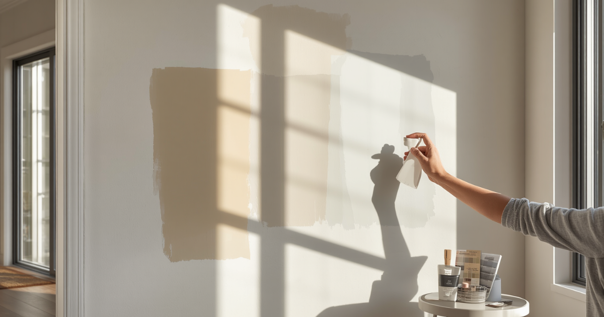
- Apply each colour to a section of the actual wall you plan to paint — at least 30 by 30 centimetres, ideally A4 size or larger
- Apply two coats over the same area to get a true representation of the final result
- Observe the samples across different times of day — morning, midday, afternoon, and in the evening under your artificial lighting
[ Screenshot: Sample pots applied to a Bankstown home interior wall for colour testing ]
What to Look for in Each Light Condition
- Morning: Eastern-facing rooms receive warm morning light that can make colours look more orange or yellow than they will the rest of the day
- Midday: The truest representation of the colour in full light — this is closest to how it will photograph
- Afternoon: Western rooms receive warm orange afternoon light; northern rooms get strong overhead light
- Evening under artificial light: LEDs, halogens, and fluorescents all affect colour differently — check that your chosen colour still looks right under the bulbs you actually use
Using Digital Tools Effectively
Paint brand apps that let you visualise colours on photos of your room have improved significantly and are worth using as a starting point for eliminating obvious mismatches quickly. Where digital tools fall short is in replicating the texture of real paint on real surfaces and the way a colour changes through the day as natural light shifts.
Why Undertone Testing Matters Most
When a neutral seems to read cold on the wall even though it looked warm on the chip, you are experiencing an undertone mismatch. The most reliable way to identify this in a test patch is to place a white card immediately next to the test colour. If the white makes the neutral look clean and warm, the undertone is warm. If the white makes the neutral look slightly grey or cool by contrast, the undertone is cool.
Testing Exterior Colours
- Apply the sample to the most sun-exposed elevation, not a shaded wall
- Observe at midday when the colour is in full direct light — this is when the difference between warm and cool undertones is most obvious
- View the sample from the street at the distance most observers will see it, not just up close
When You Narrow It Down to Two
If two colours both look good in testing, paint a dividing line between them on the same wall section. Seeing them side by side in the same light condition makes the choice much clearer than comparing separate rooms.
Final Thoughts
Testing colours with sample pots before committing is a $15 to $30 investment that can save you the cost and time of a second paint job. Always test on the actual surface and in the actual room.
If you want professional guidance on colour selection, ask our house painting team. See also our guide on choosing paint colours for a Bankstown home.
