

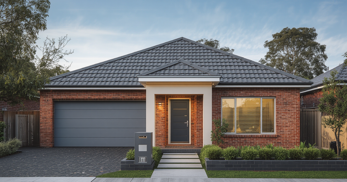

Most Sydney homeowners focus on wall colour when planning a repaint. But the wall colour you choose does not exist in isolation — it has to work with two fixed elements you almost certainly are not changing: your roof and your brick. Getting this coordination right is the difference between a paint job that looks considered and one that looks like the colours were chosen without looking at the whole house.
Start With What You Cannot Change
Unless you are also painting your roof and rendering your brick facade, these are your fixed palette constraints. Everything else is negotiable. The wall colour exists to complement them, not fight them.
Reading Brick Undertones
- Red or orange-red brick (common in 1970s and 1980s Bankstown and Canterbury homes) — pairs well with warm neutrals like greige, off-white, and warm grey; conflicts with cool blue-grey tones
- Cream or buff brick (seen in many 1990s and 2000s double-brick homes in South-West Sydney) — versatile; works with warm whites, soft greens, and light stone tones
- Grey or charcoal brick — suits cooler contemporary palettes; handles cool whites, light greys, and some soft blues
[ Screenshot: Well-coordinated Bankstown home exterior with matching brick and wall colour ]
The Most Common Mistake: Ignoring Undertone
The most common undertone conflict we see on South-West Sydney homes is a cool blue-grey wall colour applied next to warm red or orange brick. The brick emphasises the cool undertone in the wall colour, which starts to read as cold and slightly green or blue rather than the contemporary grey it appeared to be in isolation.
Reading Roof Colour
- Dark charcoal or slate roofing — works with almost any wall colour but looks most cohesive with medium to light walls rather than other dark surfaces
- Terracotta tile roofing — a warm orange-red tone that is most harmonious with walls in warm neutrals, cream, and off-white rather than cool greys
- Colorbond in Surfmist, Shale Grey, or similar — versatile and suits both warm and cool palettes depending on the specific tone
A Practical Approach
Get a colour sample card from the paint supplier and physically hold it against your brick and as close to your roof line as you can get. What looks good on a chip against white paper in a shop often looks completely different next to ochre brick and terracotta tiles in afternoon sun. If you are not sure about brick undertones, take a photo in natural light and ask your painter. Experienced painters in South-West Sydney have seen this coordination challenge hundreds of times.
When Rendering Changes the Equation
If your home has been fully rendered, the brick-coordination constraint disappears. Rendered surfaces can be painted in a far wider range of colours because the texture and undertone of the brick beneath is completely covered. This is one of the practical advantages of rendering older brick homes in Sydney.
Getting Professional Help With Coordination
Colour coordination for exterior repaints is one of the situations where an experienced exterior painter adds the most value. The variables — brick undertone, roof colour, orientation, and street context — are complex enough that getting them right requires more than looking at chips under a shop light.
Final Thoughts
Choosing exterior colours that work with your fixed elements is not complicated once you know what to look for. Start by identifying the undertone of both brick and roof, then select a wall colour that harmonises rather than competes.
Our exterior painting team can walk you through colour coordination before committing to a product. See also our guide on exterior paint colours for rendered homes in Sydney.
